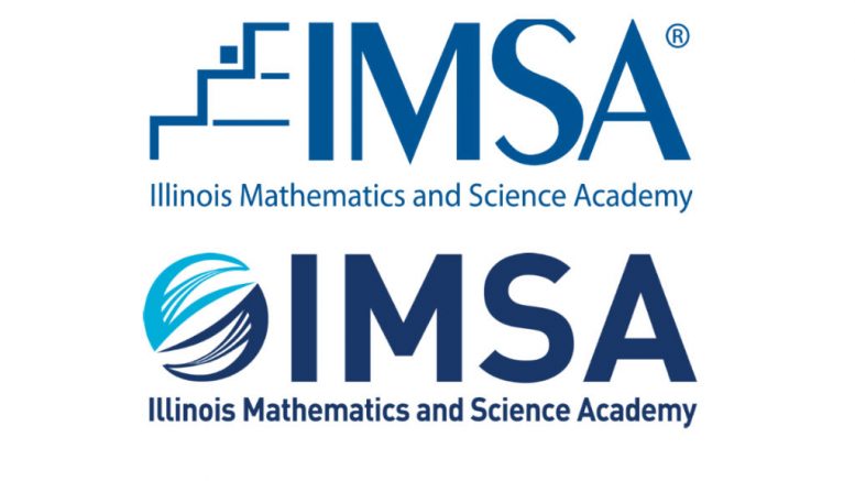
Earlier this month, IMSA’s new logo sparked some confusion among IMSA community members. The new logo was the final product of a two-year effort to realign IMSA’s brand with its original charter and evolving mission statement.
Tami Armstrong, Executive Director of Public Affairs, explained that the new logo is an attempt to differentiate IMSA from its competition. Thirty years ago, the State of Illinois issued two charters for IMSA’s founding. The first charter enabled the creation of a school for talented, STEM students. The other, lesser-known charter aimed to spread IMSA’s inquiry-based curriculum to schools across Illinois.
Armstrong theorized that the reduction in IMSA’s applicant pool over the last 5-10 years was partially due to the school’s failure to express its institutional values in its branding. “We have amazing courses. We have amazing facilities, like IN2 and the B-wing. We have amazing faculty because more than 50% have PhDs… The question is, how can you distill that into a very clear message…to help us stand out?” she says.
To better convey IMSA’s values, the school administration sought a partnership with a local firm to expand its outreach. IMSA contacted 6,000 alumni, asking them to evaluate their IMSA experiences. It received a total of 1,700 responses, most of which were positive. “IMSA opened up my world to new ways of thinking, to different kinds of people, to different cultures,” one comment reads. “Groundbreaking,” says another.
The next stage of research featured focus groups with students, teachers, and faculty. Through small-group discussion, administrators gained a better understanding of the IMSA community’s perspective of the school: an institution that challenges students academically and launches global leaders. Once they affirmed the message, they evaluated the effectiveness of the current logo.
The original documentation of IMSA’s former “staircase” logo states that the logo aimed to convey the “nature of the learning environment” through a “high-tech” and “bold” design. Possible interpretations of the logo include the journey of progressing towards a goal, the multiple steps of the education process, and the three years of study at IMSA. However, the representation of IMSA’s center of teaching and learning (PFS) was missing. Additionally, the modernistic intent of the original font had decayed over time.
The new logo aims to encapsulate IMSA’s global leadership by modeling off of the globe itself. The two halves of the image represent the school’s two charters: education and outreach. Lastly, the three white streaks within the two halves pay tribute to the former staircase logo. (“Legacy stairsteps,” Armstrong noted). Armstrong also pointed out that the shape implies “synergy between parts” and “movement,” therefore reflecting IMSA’s focus on connectivity and innovation.
Ultimately, IMSA hopes that the new logo will aid it in future outreach efforts, as it sets its sights beyond the state of Illinois. Under the new IMSA Law, it aims to admit students internationally by 2022. Already, IMSA is extending its outreach to mainland China and Taiwan in an effort to engage educators and students around the world. Whether current IMSA community members prefer to view the logo as a cell undergoing mitosis, a hamster ball, or the “Worldwide Onion,” it’s a rebranding for the school that will hopefully accompany even larger changes for the students.


Be the first to comment on "Redefining IMSA with “The Globe” Logo"