Thank you to Parth Dhyani for developing the interactive charts!
Nearly a quarter of the way through the school year, the class of 2020 has already left its mark on the school. By this point in the year, the new IMSA culture has formed – ask any current senior about their old seniors and it’s evident that with each graduating class that comes and goes, the culture of IMSA campus changes on and on. So how do the classes of 2018, 2019, and 2020 stack up against prior graduating classes? Delve into demographic data on every graduating class to come through the school, obtained via a FOIA request, and find out!
Again, the most notable trend in this graph is the rise of the Asian population at IMSA, accounting for 14.49% of the class of 1989 compared to 38.43% of the class of 2019. It’s also evident that the Hispanic or Latino population on campus has increased, going from 2.42% to 10.48%, as well as the population of students who are two or more races, going from 0% of the charter class to 6.99% of the class of 2019. The only racial group, aside from white students, that hasn’t increased its presence on campus is black or African-American students, which went from 8.70% to 7.86%.
Above is a map of the number of students that have come from each home city across every single IMSA graduating class. Click and zoom and figure out where you fit in! Then, compare the distance that you live from IMSA with this histogram below, which counts the number of student that live at varying distances away from IMSA:
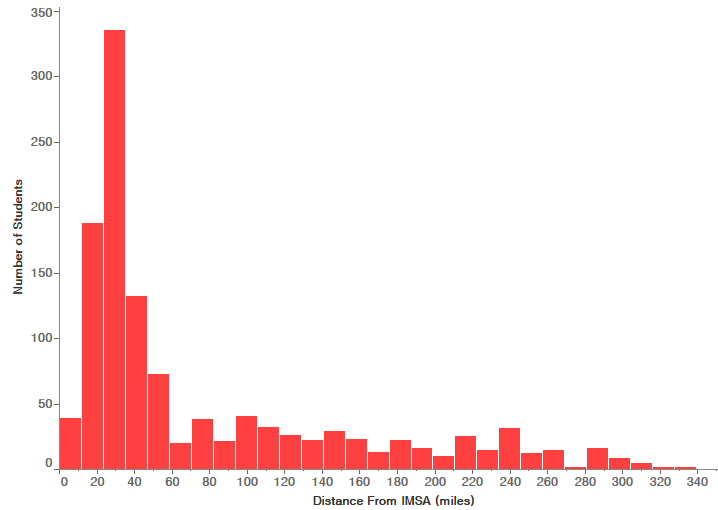
As seen in the graphs, the cities that have sent the most students to IMSA are Chicago, Naperville, and then Aurora, from which 539, 439, and 308 students came, respectively. Thus, it makes sense that the majority of IMSA students live within 20-40 miles away from the school. Interestingly, throughout IMSA’s history there have been a handful of students that came from cities out of state, including one female from the class of 2001 whose home town was San Francisco.
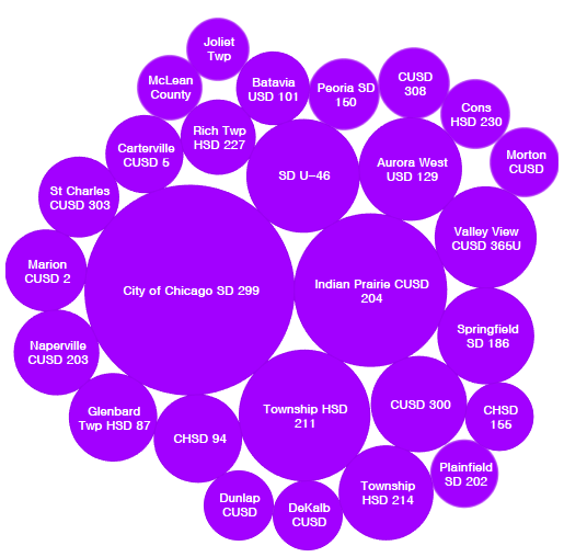
And finally, above you can see a bubble chart of the school districts that have sent the most students to IMSA. To no surprise, the Chicago Public School District has sent the most, followed by District 204. Of the five schools that have sent the most students to IMSA, 4 of them are in districts 203 and 204, Waubonsie Valley High School having sent the most (125 students), followed by Naperville North High School (99 students), Naperville Central High School (98 students), Neuqua Valley High School (75 students), and West Aurora High School (74 students).


Be the first to comment on "IMSA Demographics by the Numbers"