Dear IMSA,
Here’s your wake-up call, a call-to-action for a glamorous new look. Some of your students are sick and tired of your random orange walls, your distracting open ceilings, your lack of glass walls, your window-less rooms, and your tacky infrastructure. But, worry not, for your own students are about to share some excellent tips with you for your long-awaited IMSA glow-up.
1. Your Ceilings are Unappealing
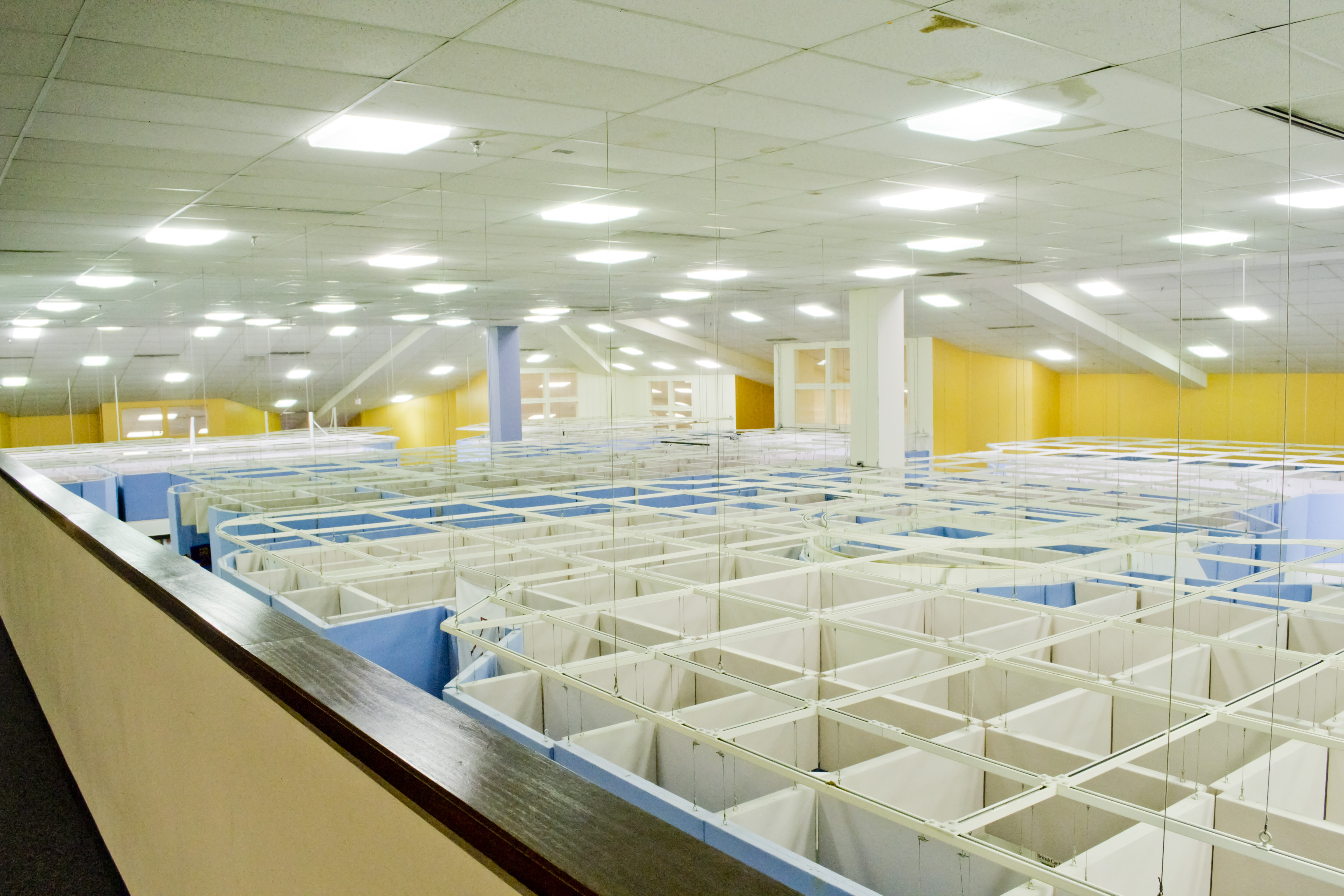
Something as simple as a new hairstyle can drastically change a person’s whole appearance—and the same goes for you, IMSA. These open ceilings need to be renovated. The idea of it is no doubt innovative, but the execution is not.

IMSA’s open ceilings | source: imsa.edu
For those who may not know: the concept behind open ceilings was to get students to foster creative thinking as subconsciously listening to the lectures from the other class allows you to learn more. The entire purpose of the Illinois Math and Science Academy is to, well, learn, so the design is ideal. However, when students are taking that LE2 pop quiz and cannot concentrate because the other class is busy discussing Greek gods loudly and seriously, it becomes problematic.
Open ceilings cause more distraction than meaningful learning, especially during times of necessary silence. Furthermore, telling other classes to quiet down is inconvenient since they are doing what they can to actively learn and discuss topics thoroughly. Even multiple teachers, who do not wish to be named, have commented on the issue: “[The open ceilings] can be a real pain sometimes,” quotes an anonymous teacher. However, students like Elaine Rao (’25) actually enjoy the essence of it: “To be honest, [the open ceilings] is a little ugly but also kinda cool and better than having ceilings.” On the other hand, Lily Zhang (’25) does not wish for open ceilings as much as she does for windows in her classes: “There’s no natural light and it makes you feel boxed in. Not the best learning environment.”
Based on these complaints from both teachers and students, it may be wise for IMSA to delve into a solution that would fix the problem of distraction, lack of sunlight, and ugly ceilings—all while simultaneously fostering students’ learning and education: skylights! According to Pros and Cons of Having Skylights Installed In Your Home – Flynn Roofing, skylights enhance the natural lighting in any room and this reduces the cost of electricity and heating. This eliminates the problem of natural lighting. Moreover, skylights add a modern, aesthetic look to any area. Just like mirrors, skylights create the illusion of space and make a room feel bigger. Students like Lily Zhang will no longer feel ‘trapped’. Elaine Rao, who found the open ceilings cool but also ugly, agreed that glass ceilings will make the school look more modern and aesthetic. Glass ceilings no doubt eliminates distraction between classes, but how do they enhance student learning? According to How to build better schools | VELUX Commercial, “Academic performance can increase by up to 15% when students work in classrooms with larger windows—due both to increased daylight, and a better view to the outside world. Students who had well-designed skylights in their classrooms actually improved 19–20% faster than those that did not.”
Some cons of skylights may be the cost of a bad installation and replacement, and also that they can bring too much sunlight or heat into a building area. However, every ideal solution has a flaw, and I believe that skylights are necessary for this school! The issue of too much sunlight and heat could be a simple fix by placement. Perhaps some areas of the classroom could have skylights installed, while other areas could have ceilings. Other than that, the pros of skylights heavily overshadow the cons.
The addition of skylights to a school not only adds natural lighting to the school, eliminates distractions, and enhances the school’s appeal, but it also encourages better student results. IMSA, you need this right now.
2. Wait, So Not Every Room Looks Like IN2?
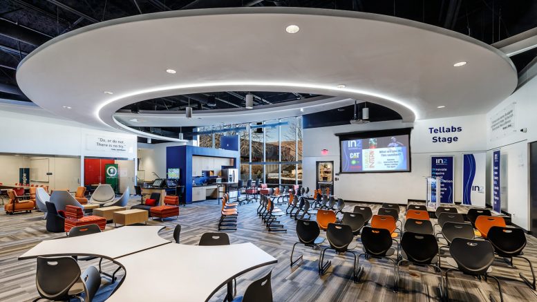
Now, this question above was the biggest surprise that hit me when I walked into IMSA. While applying, there’s no doubt that every student has searched “what does IMSA school look like.” Of course, the first few pictures that popped up were pictures of IN2, the auditorium, the Academic Pit, and the gym. I was amazed by how modern, futuristic, and well-fitting these three areas were. This is what I imagined IMSA to look like throughout the whole school. What I didn’t expect was for it to be a huge mage of tacky infrastructure that seems not to fit anywhere, orange walls in random parts of the school, and random art pieces.
Now, I know that IN2 was donated by the creator of YouTube, and that’s why it looks the way it does. IMSA would look so amazing if it just looked like IN2 everywhere, but that would be a dream come true. As of now, what IMSA needs the most is to make the entire school look more even. In my eyes, that would be making the orange walls a shade of navy blue or any other color than bright orange, red, and white.
IMSA would also look more like IN2 if they just added more glass walls to certain areas of the school. For example, the gym should have glass panels lining the upper walls in the back to bring in more natural light—that is what my elementary school did. Not to mention, there are so many science, math, and language classes lined against the wall yet nearly none of them have windows or glass walls. A single panel of glass would add more to the school than none at all!
Another way IMSA could look more like IN2 is if they spent more on modern furniture. Some of the chairs and tables at IN2 are exactly what a futuristic math and science academy centered around learning and innovation needs.
Now, for the random art pieces around the school: I actually like them, however, as Elaine Rao agrees, “I have no thought on them, they’re just kind of there.” The random art pieces scattered around IMSA definitely add more to the look, however, no one thinks twice about them. Personally, I feel it would be better if IMSA took some of these art pieces and created something like a mini modern art museum right in our old caf. It would look exactly like the area near the Student Affairs office, but all centered around the old caf. This is because the old caf is this giant white area that has nothing special to it other than the new blue couches that were added last semester. If we paint all the walls red and black, align some statues and paintings along the red walls, and rearrange some furniture so that they would be facing the art pieces, then it would truly start to look like a cozy cafe area. Not many people will admire the statues if some of them are literally placed on the ceilings.
3. You Need a Glow Up, But We Still Like You
Even though I completely bashed IMSA’s infrastructure just now, I have to say: there is just something about these random orange walls, these random Sphinx statues above the roofs of the offices, and these annoying open ceilings that make IMSA feel like home; no other school could be as random as ours.
So, IMSA, even though you are tacky and strange as ever, and need a serious glow-up, you are still my school and my second home. Hopefully, in the future, I’ll see you in a new light (literally—if you install skylights) where most of you will look just like IN2.
Sincerely,
Anjali Samal


Be the first to comment on "Dear IMSA: We Need a Renovation"